- Review the data: Once your survey has closed and your results are available, take some time to review the data and understand the results. Look at the overall trends and patterns, and identify any areas where there are significant differences in the feedback provided by different raters.
- Identify strengths and areas for improvement: Use the feedback to identify your strengths and areas for improvement. Look for areas where you received consistent positive feedback, as well as areas where you received consistent constructive feedback. This will help you focus your efforts on improving in areas where there are gaps while leveraging your strengths.
- Seek additional support. It can be helpful to receive additional support when interpreting your feedback and planning for improvements. Check with your manager if they are able to support you or if your organization offers 360-specific coaching.
- Develop an action plan: Based on the feedback, develop an action plan for improvement. Identify specific steps you can take to address the areas where you received constructive feedback, and set goals for improving your performance in those areas.
- Follow up: Once you have identified your strengths and areas for improvement, developed an action plan, and sought additional feedback or support, it is important to follow up on your progress. Monitor your progress over time and adjust your plan as needed to ensure that you are making progress toward your goals.
Differences in feedback
While reviewing and analyzing your feedback, it's important to identify differences or inconsistencies in 360 feedback results, and consider why they exist. Try to look for patterns or themes that emerge from the feedback. While the reviewer groups may have different expectations and different perspectives, it can be useful to reflect over why they are different and ask yourself if you behave differently when interacting with each reviewer group. The priorities of individuals in evaluating their managers vary according to their role and relationship with the manager. Managers tend to emphasize technical expertise and measurable outcomes, while peers tend to prioritize collaboration, interpersonal skills, and the ability to influence. Direct reports, on the other hand, tend to focus on their manager's coaching abilities, leadership skills, communication style, and overall managerial competence.
It can also be helpful to compare your own self-assessment to the other 360-feedback you receive from the reviewers. If you find significant gaps in how you rated yourself compared to how others rated you, reflect on your self-assessment: Did you have different expectations or goals for yourself? Were you being overly critical or optimistic? Were there any biases or blind spots that influenced your self-assessment? Reflecting on your ratings can help you gain insight into why you rated yourself differently from others.
How to read your 360° feedback report
Your report is divided into the following sections:
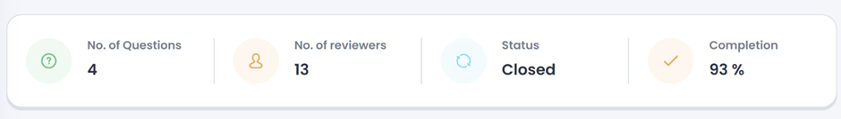
Survey summary
- Number of questions
- Total number of reviewers
- Status of the survey
- Completion percentage
Filters
Select which reviewers you wish to see feedback from in your report. If you are unable to turn on a filter, there are not enough answers in the group to show results. Aggregate the reviewers if you want to combine the different reviewers’ feedback rather than looking at their feedback as separate groups.

1-5 Questions
The questions using a 1-5 scale will be presented in a circular chart. In the chart you can view the average result from all 1-5 questions. They will be separated by review group unless you have chosen to aggregate the reviewers' answers. Below the circular diagram, you are able to view the average result from each category and click in on a category to see all questions associated with the selected category.

Spider chart

Multiple Choice Questions
Using multiple choice questions allow the reviewers to choose one or more options from a list of answers that you create. Data from multiple choice questions is easy to digest and analyze. You will be able to see the distribution for each category.

NPS Questions
The NPS questions will be presented on the regular NPS scale (-100 to +100) and the reviewers will be labeled as detractors, passives, or promotors depending on their rating. See how NPS is calculated here.

Open-ended Questions
